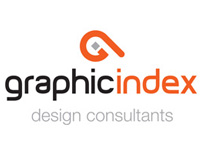
Graphic Index are proud to announce our recent re-brand.
The business began in 1998 and the current identity has served us well since it was designed and launched in 1999 with minor updates in 2001. The business began with a clear focus on corporate identity design and illustration and print management.
Over the years we expanded into other areas such as multi-media and web design. This range of services and expertise presented our client base with a complete visual communications offering – hence the concept of the “index,” a reference point for all things “graphic” design.
The symbol we designed in 1999 represents an obsolete typographic character called an “index” or manicule (from the Latin root manus for ‘hand’ and manicula for ‘little hand’). The index was used in manuscripts since the 12th Century and was popular in print into the 20th Century to draw attention to important information in a document. You may be familiar with this pointed finger symbol, often elaborately drawn. Our version of the index was more abstract and incorporated our initials GI.
Our new logotype retains the original concept, just rendered in a more contemporary style. Our black and orange colour scheme also survives although the shade of orange has changed a little too. We are excited about the fresh new look of Graphic Index which follows a complete business review and a positive outlook on the future. Our new signage went up recently and our new stationery and website is about to launch.


